This is a guest post courtesy of the team over at Company Folders, on what it takes to create a powerful biz presentation.
I tend to avoid things with the word presentation in them myself, so I thought deferring to someone with more experience in them would be a good idea, for those of you that do erm… present stuff.
Please feel free to drop any thoughts or questions in the comments below.
On the surface, it would seem that the purpose of a business presentation is to impart important information on an audience who would benefit from hearing it.
While this is technically true, a much deeper purpose is to exhibit your brand to an audience who can help it grow, and to give them a taste of what you’re all about.
Your presentation might not be about your brand—it might be about something completely unrelated—but that doesn’t mean your brand shouldn’t have a strong presence anyway.
Likewise, even if you don’t intend on showing off your brand, it will nevertheless be on display during a presentation.
The way you look, the materials you use and even the way you speak will have an impact on the way your audience perceives you.
Therefore, the most successful strategy for a business presentation is to deliver the best possible representation of your brand with every tool at your disposal.
Presentation Handouts

Chances are that your presentation will have a physical counterpart—some sort of package of information for your audience to follow along with and to take home with them.
If not, you should seriously consider adding one to your presentation.
Not only do presentation handouts help promote your brand, they give the audience something physical to connect to your presentation.
The more senses your audience uses to experience your brand, the stronger impression it will make.
Just as your speech affects the audience’s sense of hearing, your presentation materials give the audience something interesting to look at and touch.
Therefore, you’ll want these materials to be customized with exciting designs and different physical textures to really enhance your audience’s visual and tactile experience.
A presentation folder is a must-have, as it keeps all of your handout materials together in one neat, branded package. Not only can folders hold all of your handout materials, they can be used to sneak in other print media that will help sell your brand.
Adding media slits to your folder pockets gives you room to distribute brochures, business cards or even digital media on a CD or flash drive.
Image Credit: CompanyFolders
Business Cards
A fully-loaded information package is not always going to be appropriate for your presentation.
However, business cards suit any presentation size, whether it’s an hour long speech or a thirty second elevator pitch.
Business cards accomplish the same branding goals as a handout package, only on a smaller scale.
They deliver important contact information while also providing visual and tactile interest.
There was a time when some thought that e-mail, social networking and the like would completely wipe out the practice of handing out business cards.
However, the exact opposite has happened—technology has transformed the use of business cards into an art form unto itself.
Printing technology has also evolved over the years, which means that it’s possible to have a truly unique business card and still stay within your budget.
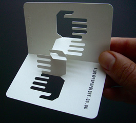
Break free from templates and come up with a design that is truly unique, not fill-in-the-blank. Consider a custom die-cut design to change the actual shape of your card.
Your brand is anything but cookie-cutter, so your business cards should be shaped to follow suit.
Image Credit: popupology
Multimedia Elements
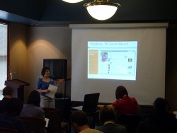
If your presentation is to include any media elements (most commonly PowerPoint slides), try as best you can to have your visuals match your brand identity.
For example, use your brand’s font face and color scheme on all of your slides. If you have images associated with your brand, try to incorporate those, too.
Keep in mind that boring slides can make you brand look boring by association. Think of your presentation like telling a story to a small child.
The visuals are there to help enhance the story; they shouldn’t necessarily be the story. Nobody wants to sit through a presentation where the speaker merely reads from the screen.
Multimedia elements aren’t necessarily limited to presentation slides—try experimenting with adding short videos or even audio cues to your speech.
And if you prepare a presentation packet, be sure to include copies of your multimedia elements whenever you can. This makes it easier for the audience to recall details about your presentation when they reexamine your materials later on.
Image Credit: ccplbusiness
Stage Settings
You may not have direct control over the space in which you give your presentation, but that doesn’t mean you can’t make the space your own.
For example, if you know that you’ll have access to a podium, consider bringing a branded vinyl banner to put in front of the podium.
If you don’t have anywhere to hang it, try a free-standing vertical banner or even something as simple as a nice poster on an easel.
The benefit to this extra “set dressing” is repetition and familiarity of your brand. Every time your audience looks up at you, they will see your brand on display.
Even a short presentation will give your audience plenty of time to become familiar with your brand.
After all, when is the last time someone stared at one of your billboards or print ads for a full half hour? Or even a full ten minutes?
When you’re giving a presentation, you already have a captive audience; utilize their captivity as best you can to put all eyes on your brand.
Websites and Social Media Pages
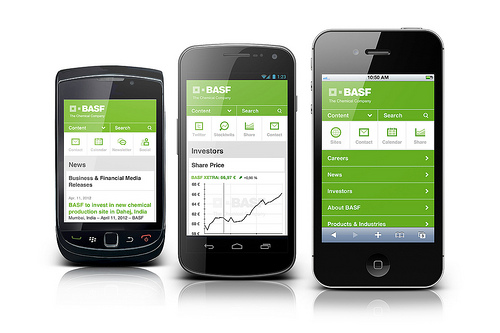
Like it or not, members of your audience probably own smart phones, which they may use to access your website and social media pages immediately before, after or even during your presentation.
You may think of your web presence as a completely separate entity from your on-stage presence, but with today’s technology, they will be forever, intrinsically connected.
This means if you want to make a good impression during your presentation, you have to make sure your website and social media pages are up-to-date, easy to browse and interesting to look at.
Don’t try to pretend that your audience isn’t sneaking a peek at their phones—embrace the fact that they are.
It means they want to know more about your brand, so make it easy for them to clearly understand your company’s message online.
Go a step further and make it as easy as possible for your presentation audience to access your website.
Add website URLs to your printed marketing materials and QR codes that let smartphones and tablets directly link to a website through a camera.
Of course, this means you’ll also want to make sure your website is compatible with smartphones and tablets, or else offer a special version of your site that has been optimized for mobile devices.
Image Credit: BASF
Personal Appearance
When you give a presentation, you become an extension of your brand. The way you look and the way you carry yourself will have an effect on how the audience views your company.
It’s probably common knowledge by now that you should have impeccable hygiene, professional attire and use friendly, confident body language.
However, you might not have considered tailoring your look and body language to best represent your brand.
Is your brand hip and trendy or is it established and dignified?
Do you have a casual work environment or is it strictly suit and tie? You don’t want to present yourself as something that your brand is not.
That doesn’t excuse you from wearing nice clothing or combing your hair; it just means try not to overcompensate. Consider the environment and audience you will be speaking to and dress accordingly.
You want the audience to be comfortable with you, so if you’re wearing a three piece suit to a presentation at an outdoor company retreat, you’re going to stick out like a sore thumb.
Language and Tone
In addition to your appearance, consider the way you present your ideas to the audience.
You already know to speak clearly and loudly, but you also need to be aware of your tone and the type of language you use.
What you say and how you say it should match your brand identity—so don’t try to overcompensate by being overly verbose.
Imagine yourself having a conversation with the audience.
You want to be friendly, open and enthused, but you also want to accurately portray your brand. Don’t be afraid to let your own personality shine through.
Think of the way you interact with your coworkers and customers and try to invoke that same feeling with your audience.
Don’t fret over things like trying to be funny or trying to sound overly-professional. You want to sound as natural as possible so that the audience will become engaged and will believe what you have to say.
If you try to force yourself too hard to put on a fake persona, you will come across as phony to your audience.
Instead, figure out what it is about you that makes people want to engage socially and bring those qualities to your presentation (so long as those qualities are in line with your brand identity).
Freebies
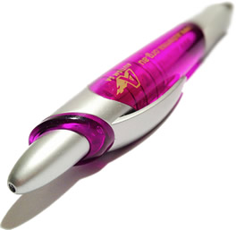 Never underestimate the power of a free gift. Handing out freebies at the end of your presentation is a great way to thank the audience for their time and it gives you another chance to put your brand on display.
Promotional items like magnets, pens, drinkware and apparel can be customized with branded design elements, and your audience is also more likely to hold onto these items longer.
If possible, find ways to tie your freebie into the message of your presentation to really help drive home your point.
You can even pass out the freebies ahead of time and have the items tie into audience participation moments.
For example, if the message of your speech was about whistleblowing, you might pass out branded whistles and encourage the audience to blow them at opportune moments of the speech.
When the audience blow their whistles again later on at home, they’ll be brought back to that moment in your presentation and will be more likely to retain what you said.
Product samples are a great way to get the audience to directly interact with your brand.
If trial-sized physical samples are not possible, consider giving out coupons that the audience can use to experience your product for free or at a discount.
If your brand provides a service instead of a product, consider vouchers for a free trial.
Image Credit: Theenmoy
Final Thoughts
Chances are that your audience wouldn’t be offended if you spent a few minutes at the end of your presentation to explain your company and to field any questions.
The branded materials are just there to emphasize and reinforce your brand identity; they should not be doing all the work on their own.
Remember to find a way to ensure your audience knows your brand without the use of your materials. Make a brief introduction at the beginning of your speech explaining who you are and what your brand is all about.
Promote your brand again at the end. And whenever it’s natural, use anecdotes in your presentation that tie back to your brand.
Your brand might not always be the subject of your presentation, but it should always be your focus.
Over to You
Are business presentations something you engage in regularly? Have tips or horror stories about your own presenting experiences? Feel free to comment, and if you found this a useful read, sharing is appreciated.
