With more than 28 million businesses licensed in the United States, according to the latest U.S. Census data, how do you get your company noticed? How do you help your brand stand out?
Or more importantly, once noticed, how do you get your people to remember you?
Danceupanddown,doalittlejig,wavingyourhandsaroundlikeacrazywoman,err,man?
Thencollapseonthegroundinexhaustion? ::bends over and heaves, totally winded::
That would definitely get you noticed and remembered by at least one person I’m sure. But I wouldn’t recommend it as very efficient or easy to scale.
Enter the logo. Dum, da da dum.
That tiny little graphic of creative flava you will wind up appending to virtually every piece of marketing collateral you will ever create for your biz. (It’s like the squirrel-y gray hair that keeps popping up no matter how many times you color… OK, maybe not quite that.)
In short, a logo is your company’s equivalent of a name tag smack in the middle of a large convention.
It’s mission:
To say “Hello, My Name Is Bob!” so people will recognize you far and wide, no matter where you go.
That said, it takes time and a wee bit of creative restraint to design a logo that leaves a lasting impression. You can show off that restraint while getting busy with some of the tips below in making your biz memorable.
And please remember, I said restraint people. Restraint!
Logo and Brand
If your company name is the text way by which people recognize you— your logo is the graphic way by which people recognize you.
Through the use of colors and fonts, often in a very simple fashion, your logo becomes a sort of mental “shortcut” to bringing your business to mind, notes the Small Business Chronicle.
Your logo should invoke not just a memory of your company, but ideally a memory of a positive experience with your company and service or product. Remember, everything is about the experience.
A little demonstration my lovelies…
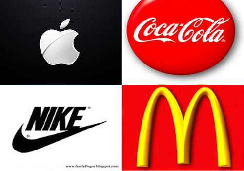
Here are four company names. Picture their logos:
- Apple
- Coke
- McDonald’s
- Nike
When you picture each logo, what are you thinking and feeling? What experience have you had with these companies? Good, bad, indifferent?
OK, OK, I know it can sometimes be hard to visualize something in your mind’s eye. Let me help a reader out. hehe
How about now? Thinking something? Feeling something? Anything a’tall?
Thought so.
The simple act of viewing a logo that’s part of a company brand can elicit many feelings, which is key to retaining customer connection.
Less Is More
Now let’s try another homework assignment. Take a gander at the logos for the above companies again.
OK, OK, I’ll tell you, stop twisting my arm! Sheesh.
The short answer is simplicity my friend. They are all quite simple actually.
::whips out handy dandy notebook::
And… according to Entrepreneur, 95 percent of the top brands only use one or two colors in their logo. Slightly more than 40 percent use all text. While almost 10 percent have no lettering at all.
Consider how each company projects its logo:
- Apple—white; no lettering
- Coke—red; all lettering
- McDonald’s—yellow; no lettering
- Nike—black; official logo includes the name but the “swish” can be used stand-alone with no lettering.
The creative energy going into your logo needs to be focused on a visual that is designed to evoke desired feelings in your customers.
In other words, it’s not designed simply to be admired in and of itself as a masterpiece of art… it’s art designed to do a job.
And never fear, even if you don’t have a visually creative bone in your body, you can still come up with ideas for a fab logo, using a service geared to getting your creative juices flowing and making the process (mostly) painless.
The Logo Garden free logo option for instance, lets you experiment with different designs to determine how your company is represented using multiple graphic approaches.
Try a bunch of different variations and see how your feelings change each time you look at a different style.
Match the Logo with Your Industry
Inc.com displays a slideshow of successful logos. Somehow, each one matches the business type. In other words, a logo of brightly colored balloons for your medical equipment manufacturing company may not be the best visual representation of your product. Just sayin’.
Nor would you likely want to choose a skull-and-crossbones theme for your organic food business. Take the time to look through various company logos and ask yourself how they connect with the specific business they are representing.
Even if you decide on a letters-only format, such as Coke and Pepsi, the font and colors you choose are important.
For instance, an industrial-looking font in steel gray probably wouldn’t be a good fit for a children’s clothing company. Soft lettering and warm colors would be much more appropriate.
Get It Right the First Time
Your logo is part of your entire brand “package” and the moment you release it to the public, it will begin to be associated with your company. It’s just the way we humans are wired.
You don’t want to go changing it up mid-stride.
Not only that, but after it’s released and you gain any sort of visibility, it’s can be difficult to change your logo anyway.
Ultimately when you attempt to do so, you are asking people to change the image they have of your company already embedded in their minds, which is no mean feat. So… get it right the first time if at all possible.
Small businesses, especially solo enterprises, may be tempted to rush the process. Please don’t. Take your time. Do a little due diligence on what will represent your company best.
Colors, fonts, images and wording in your logo need to be right, preferably the first time.
And one final word ‘o wisdom… make sure you’re not infringing on another company’s trademarks—a legal battle between you and a much larger company over a logo would be time consuming and costly. When in doubt, always err on the side of ummm… totally original. Capeesh? Capoosh.


